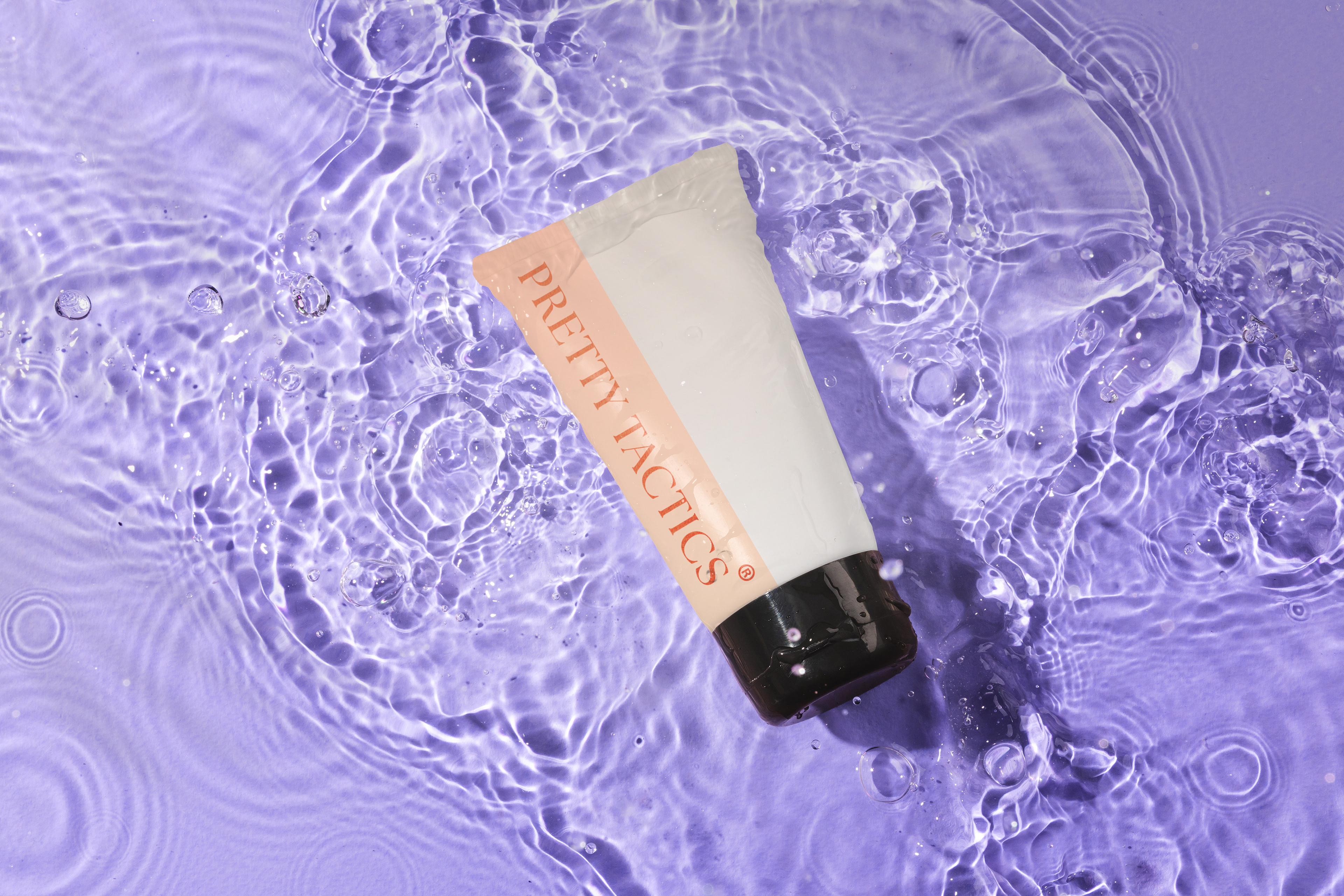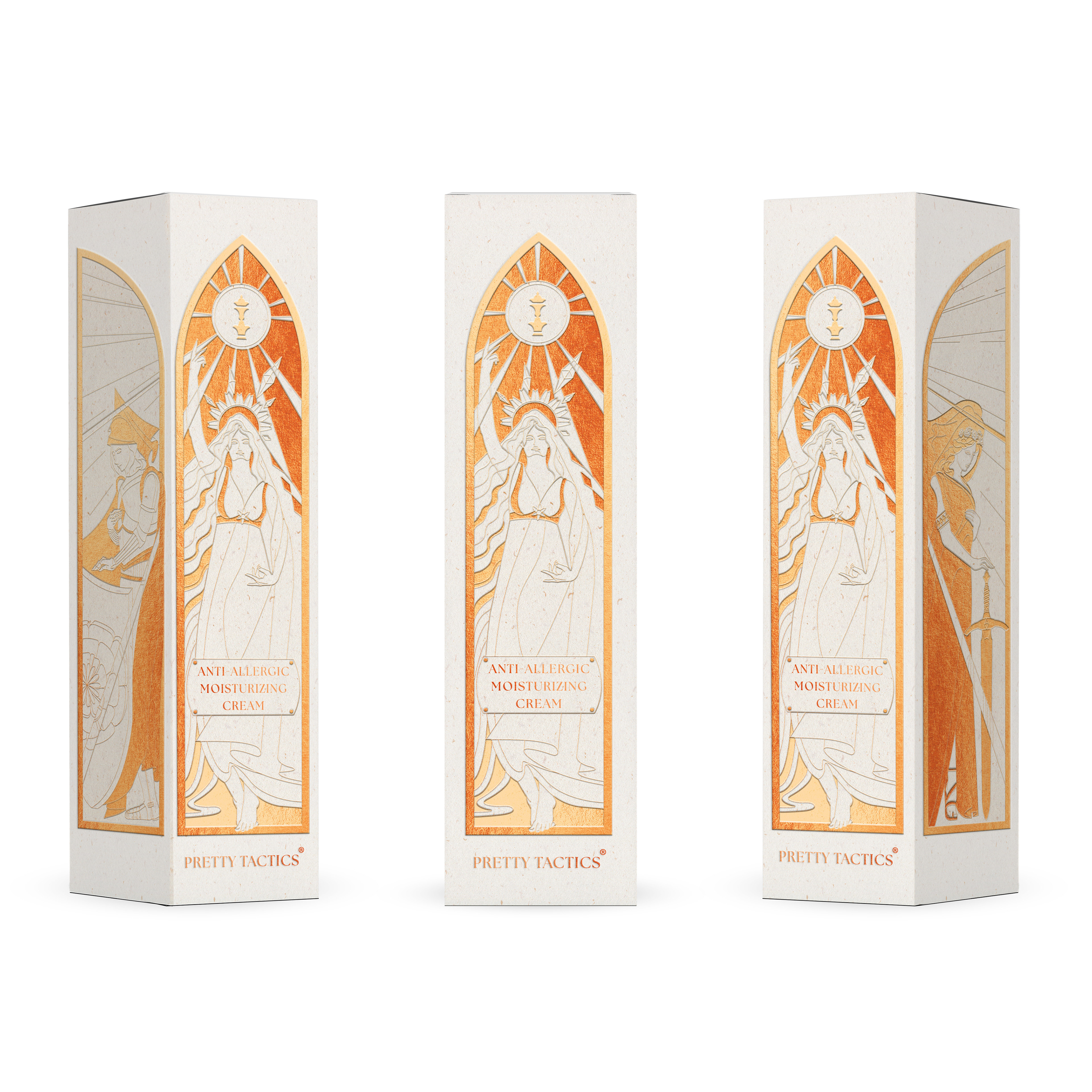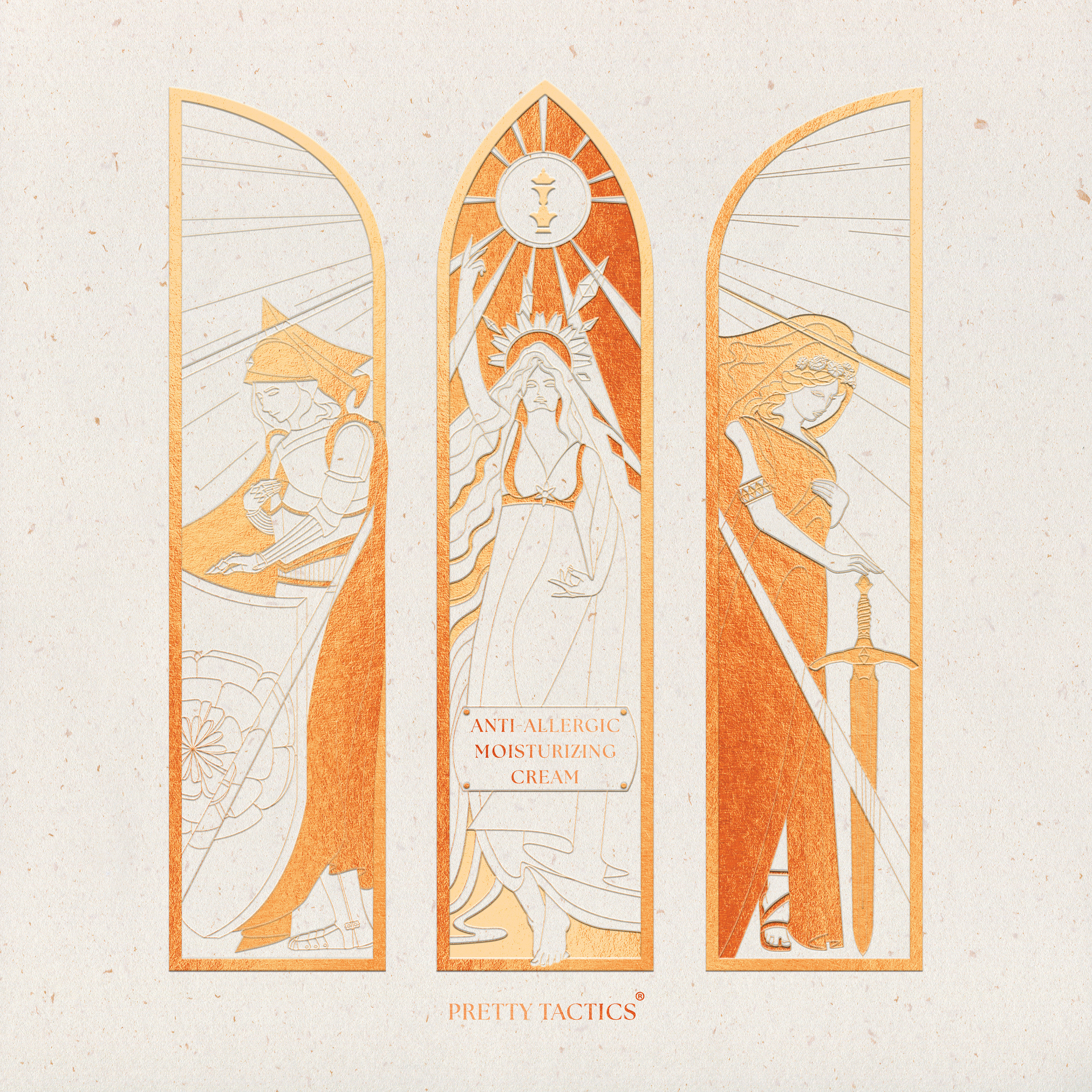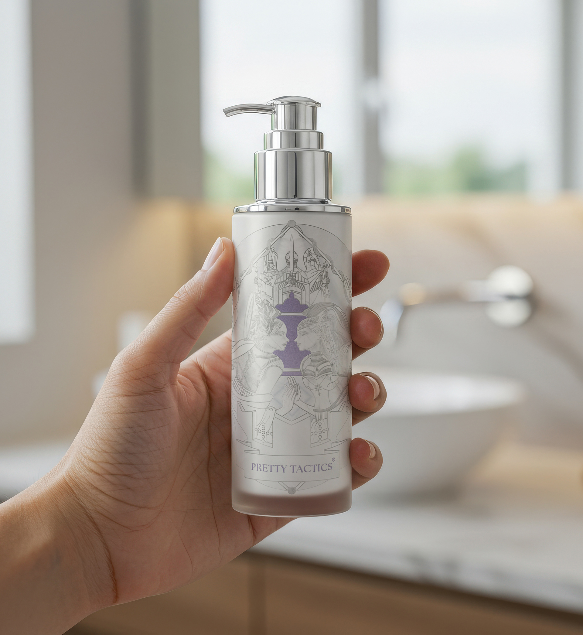


For this project, I designed a logo based on a chess piece, using negative space to incorporate two female profiles. This visual symbol reflects the brand’s core values: strength, beauty, and wisdom. Chess was chosen as the central motif because it represents tactics and elegance, and also offers future flexibility for brand development beyond natural herbs and florals. To support long-term growth, I created a brand system built on three elements, elegant game, floral & herb, and individuality & power, giving the identity room to evolve across campaigns and marketing outcomes. The packaging design draws inspiration from the stories behind each key ingredient, often herbs or flowers, and connects them with historical or mythological female figures. For example, Shea butter references Cleopatra in Egypt, while Marigold links to the sun goddess and blessings of strength. Each illustration combines these narratives with visual themes of strength and femininity, reinforcing the brand’s empowering image of modern women. The result is a distinctive identity and packaging system that balances storytelling, illustration, and brand consistency.
